Distribution Plots
The Distribution Plots object allows users to visualize categorical data variables using mainstream plots such as bar charts, pie charts, histograms, and polygons with an interactive interface and several configuration options. It is a useful object to visualize a general profile of your dataset.
In Astera Centerprise - Data Analytics Edition, users can plot these graphs on data with up to half a million categories and display it easily with the drill-down feature.
In this document, we will learn how the Distribution Plots object can be used to plot and visualize your data.
Bar Chart
A bar chart is a pictorial representation of grouped data in the form of rectangular bars. The height of the bars depend on the aggregates of numeric fields, grouped together by distinct categories of a categorical variable.
Users can construct a simple bar chart as well as a stacked bar. For the following example, you can download the sample data file from here (hyperlink).
Using Distribution Plots
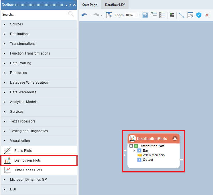
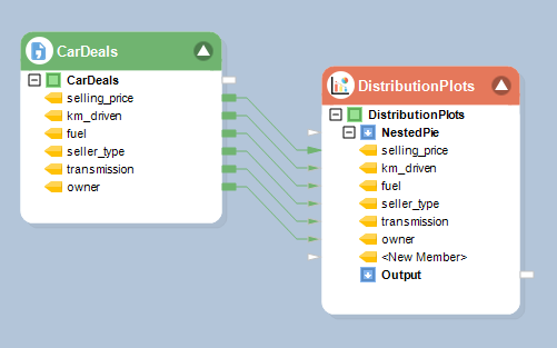
1. To get a Distribution Plots object from the Toolbox, go to Toolbox > Visualization > Distribution Plots and drag-and-drop the plot object onto the dataflow designer.
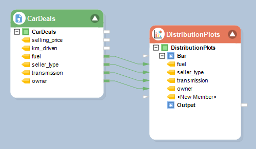
2. Auto-map the source fields by dragging and dropping the root node of the source object onto the Bar (input) node of the Distribution Plots object.
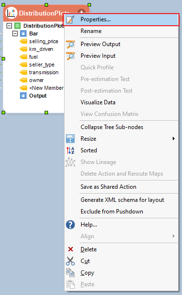
3. Right-click on the object’s header and select Properties from the context menu.
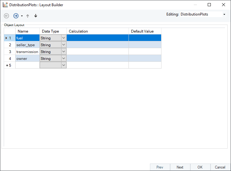
A configuration window will open as shown below. This is the Layout Builder, where users have the option to change the name or Data Type of the fields, apply expressions, and provide a Default Value in case of null and empty records.
Click Next. Here, users have the option to select Plot Type and define plot properties.
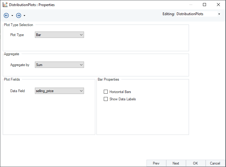
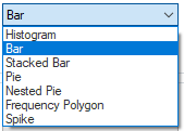
4. Plot Type is set as Bar by default. The drop-down menu of this options contains several plot types.
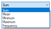
5. Set Aggregate by to Frequency. The drop-down menu of this option contains 5 aggregate functions.
6. In the Plot Fields group box, users can select a Data Field to apply the selected aggregate function. Only with Frequency aggregate type, the object automatically selects the first mapped field and disables the option, as shown below.
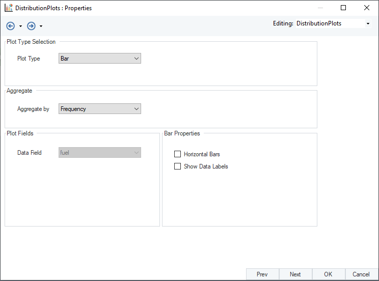
There are additional plot display properties under the Bar Properties group box.
- Horizontal Bars – Changes the orientation of default vertical bars to horizontal bars.
- Show Data Labels – Displays data labels inside bars when the chart is rendered.
Check these options and click Next.
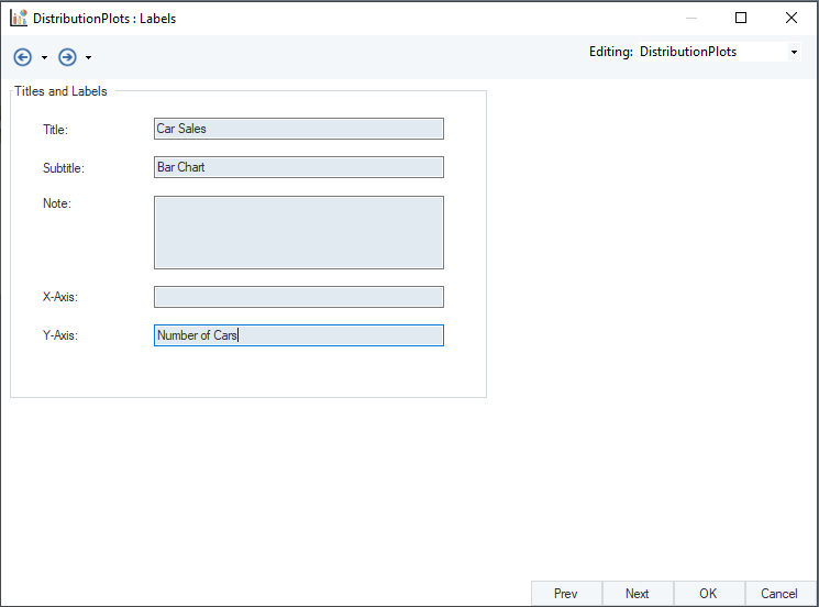
A Labels screen will appear. Here, users can fill in the labels for Title, Subtitle, X-Axis, and Y-Axis.
Click Next. An Additional Options screen will open, providing the following controls.
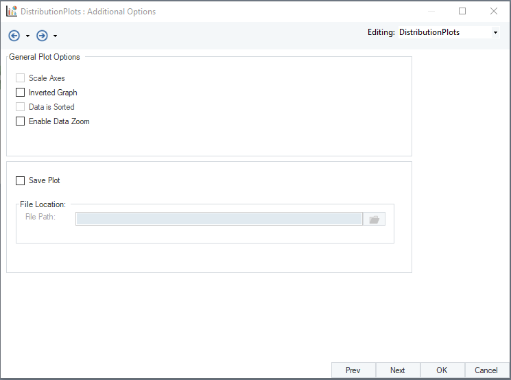
General Plot Options
- Scale Axis – Scales the x-axis and y-axis as per the starting values of respective tables.
- Inverted Graph – Inverts the graph by displacing the axis.
- Data is Sorted – Sorts incoming data in case it’s unsorted.
- Enable Data Zoom – Provides controls to zoom on data points with respect to both axis
Save the plot with .html extension by selecting the Save Plot checkbox.
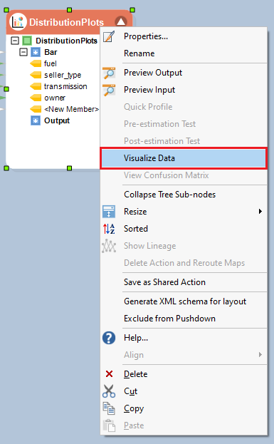
7. To visualize the plot, right-click on the Distribution Plots object’s header, and select Visualize Data from the context menu.
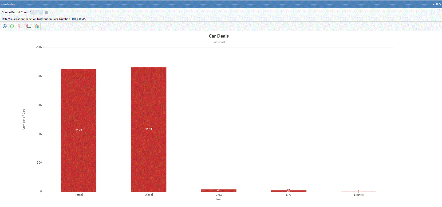
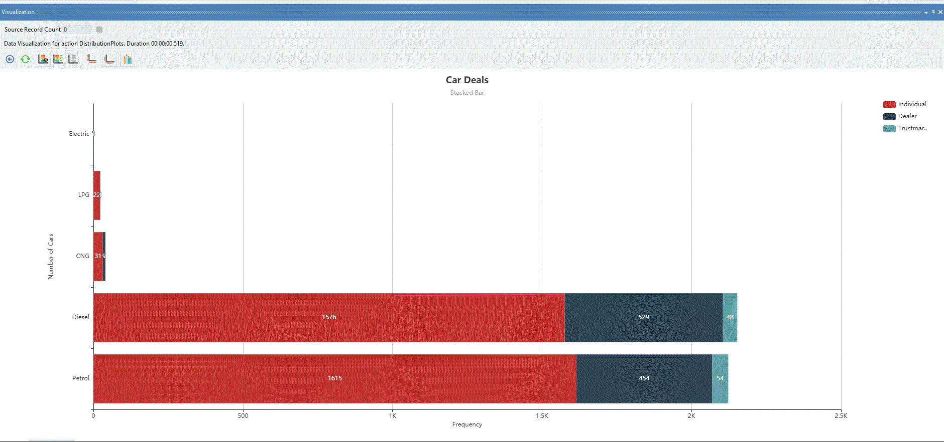
A Visualization window will open, displaying the bar chart. You can click on the bars and drill down to next level of categories.
On the same data, users can also plot Stacked Bar available in Plot Types drop-down menu.
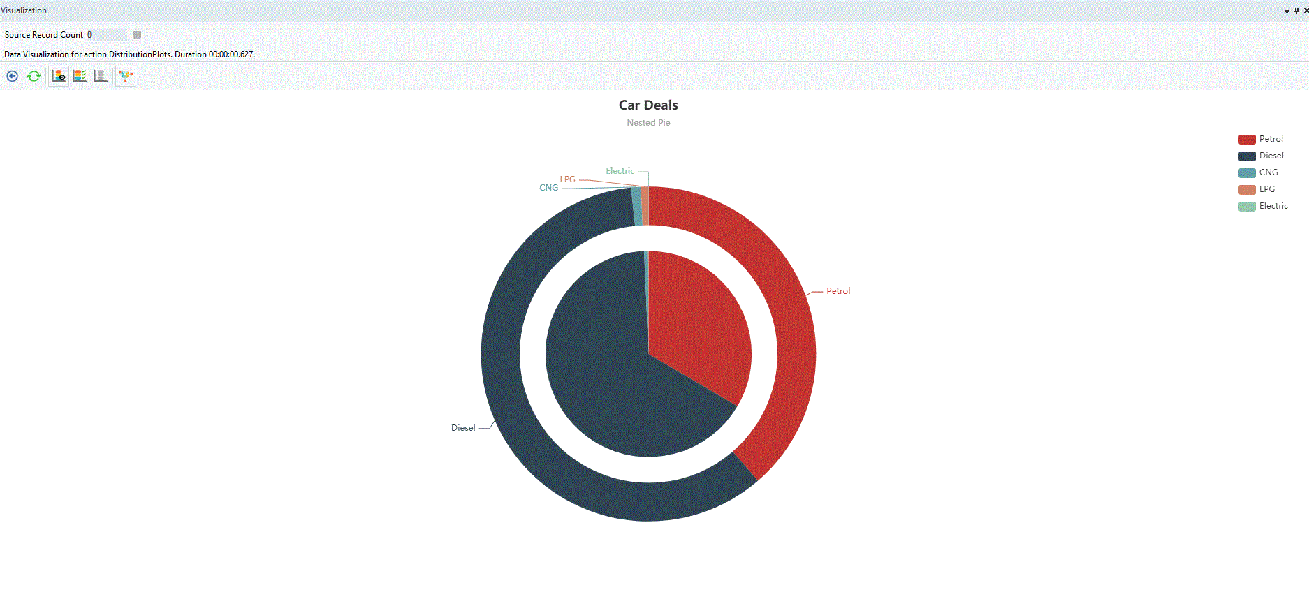
Pie Chart
A pie chart is a pictorial representation of grouped data in the form of sectors of a circle. The area of the sectors depends on the respective percentage proportion of categories in a data field.
Users can construct a simple pie chart, a doughnut chart, and a nested pie.
For the following example, you can download the sample data file from here (hyperlink). A simple pie chart is configured the same way as a bar chart. Therefore, in this example, we will create a nested pie that has different configuration settings.
Using Distribution Plots
1. Follow steps 1-3 of Bar Chart example.
2. Set Plot Type to Nested Pie.
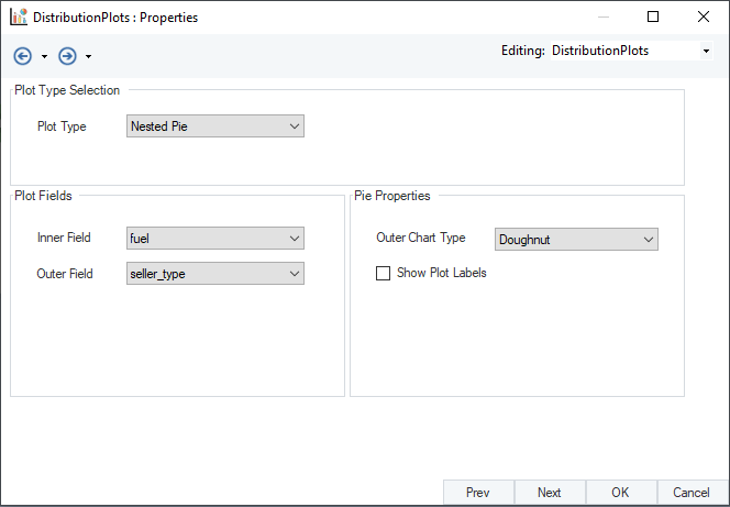
3. In the Plot Fields group box, users can select an Inner Field and an Outer Field for respective inner and outer pies.
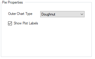
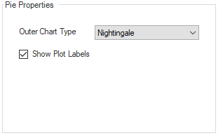
There are additional plot display properties under the Pie Properties group box.
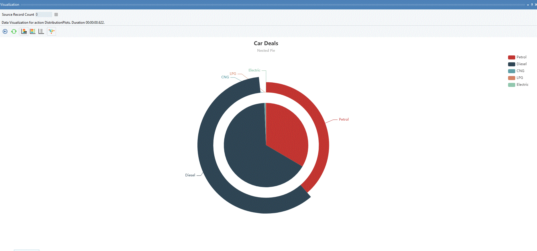
Outer Chart Type – Provides two outer chart display options.
Doughnut:
Nightingale:
This concludes our discussion on using the Distribution Plots object in Astera Centerprise.