Basic Plots
The Basic Plots objects allows a user to understand and analyze their data/transformations through visual representation such as line charts and scatter plots. They provide interactive visuals with growing capabilities and features that enable an in-depth understanding of the nature of the data and its trends.
In this document, we will learn how Basic Plots object can be used to construct a Scatter Plot and Line Chart on our data in Astera Centerprise - Data Analytics Edition.
Scatter Plot
A Scatter Plot is a graph on cartesian coordinates to show the relationship between two variables - X and Y. Each coordinate pair (x,y) is shown as a dot on the scatter plot diagram.
Using Basic Plots
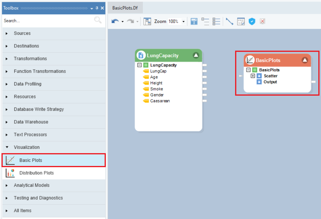
1. To get a Basic Plots object from the Toolbox, go to Toolbox > Visualization > Basic Plots and drag-and-drop the object onto the dataflow designer.
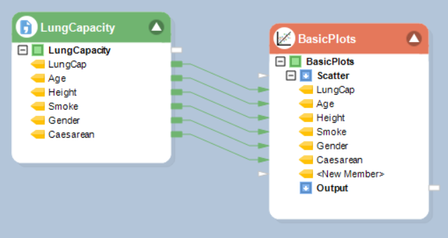
2. Auto-map the source fields by dragging and dropping the root node of the source object onto the Scatter node (input node) of the Basic Plots object.
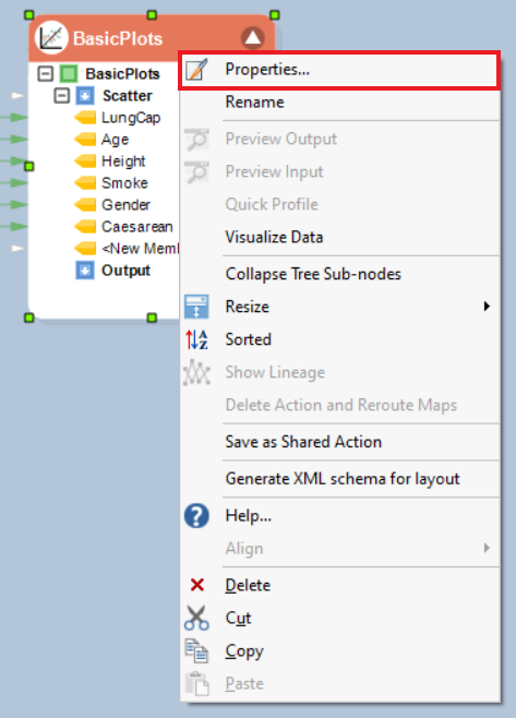
3. Right-click on the object’s header and select Properties from the context menu.
A configuration window will open as shown below. This is the Layout Builder screen, where users have the option to change the Name or Data Type of the fields.
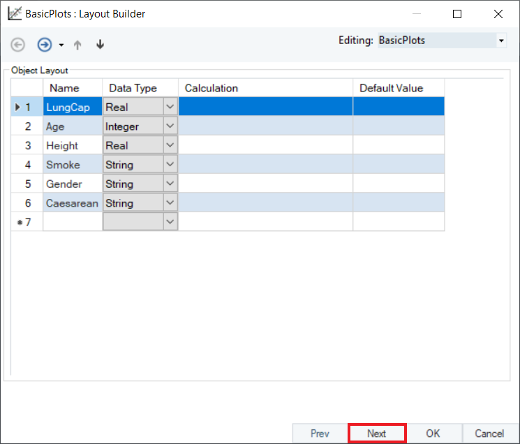
Click Next to go to the Properties screen.
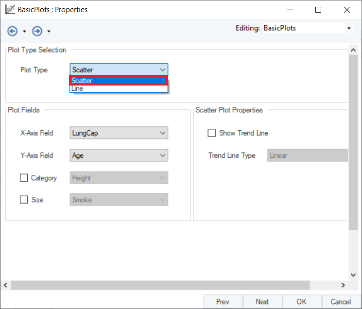
4. Here, the users have the option to select and configure the plot type, and set plot properties. Click on the Plot Type drop-down, and select Scatter from the menu.
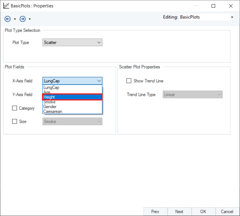
5. In the Plot Fields group box, select Height as the X-Axis Field, from the drop-down containing all the mapped fields.
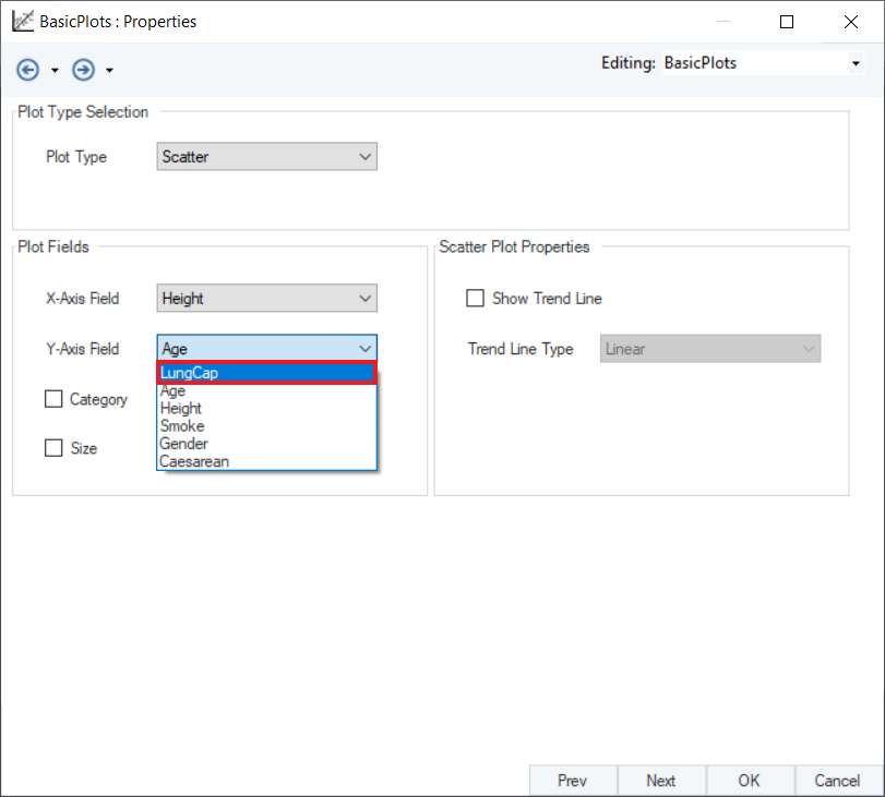
6. Similarly, select LungCap as the Y-Axis Field from the drop-down that shows all mapped fields.
7. Check the Size and Category check-boxes if required, and select the Category and Size field respectively from the provided drop-down options.
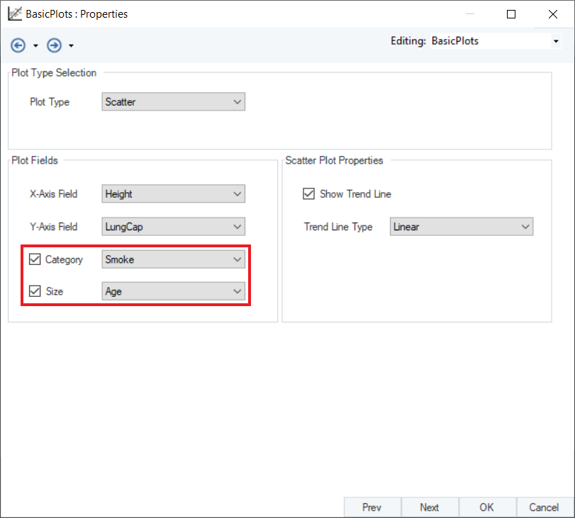
- Category – Defines different color schemes for different categories associated with the data points.
- Size – Changes the size of the scatter points on the graphs, proportional to the numeric value of the selected field.
8. Check Show Trend Line to fit a trend line on the data if it is required. When checked, the user has multiple Trend Line Type options to choose from in the drop-down menu.
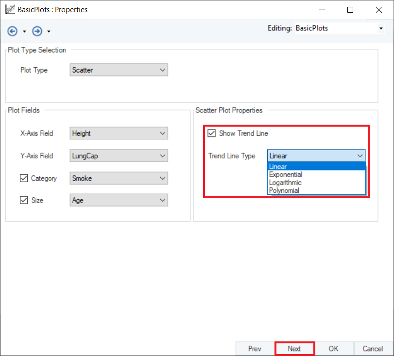
- Linear: Trend line that varies linearly as per the changes in the X-Axis variable.
- Exponential: Trend line varies exponentially as per the changes in the X-Axis variable. It starts with low momentum and accelerates later.
- Logarithmic: Trend line varies logarithmically as per the changes in the X-Axis variable. The growth/decay accelerates initially and then damps.
- Polynomial: Trend line varies as a function of nth degree polynomial as per the changes in the X-Axis variable.
Check this option and click Next.
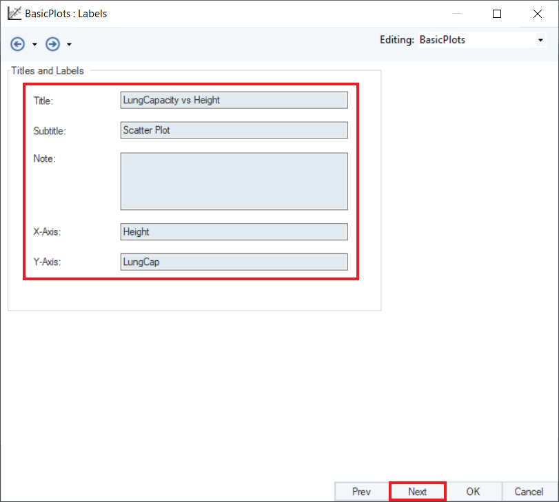
9. A Labels screen will appear. Here, users can fill in the labels for Title, Subtitle, X-Axis, and Y-Axis. Click Next.
10. An Additional Options screen will appear, providing the General Plot Options and the option to Save Plot.
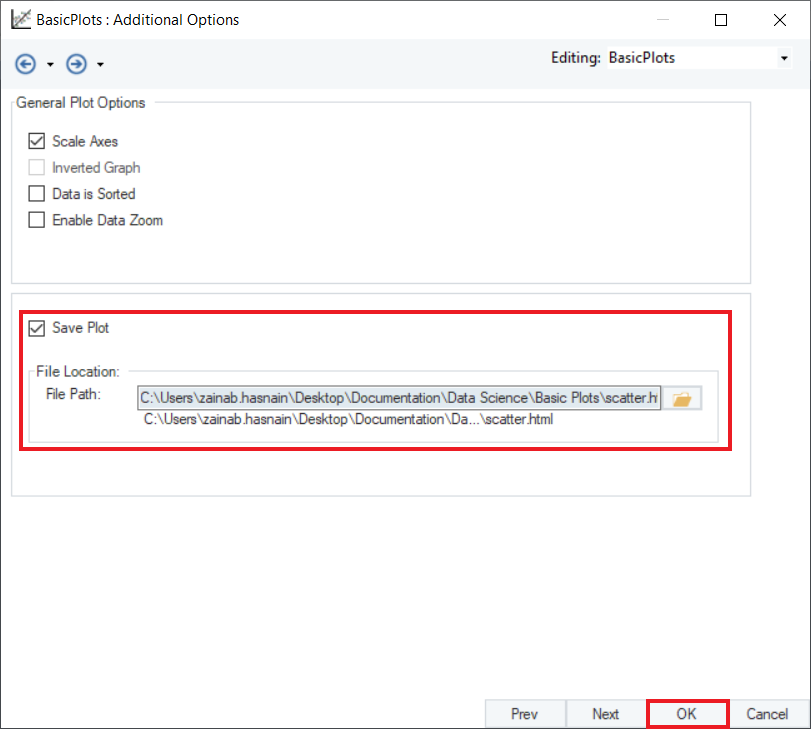
- Scale Axis: Scales the x-axis and y-axis as per the starting values of respective tables.
- Inverted Graph: Inverts the graph vertically (top-down). This option is disabled for the Scatter Plots object.
- Data is Sorted: Sorts incoming data if it is unsorted.
- Enable Data Zoom: Provides controls to zoom the data points with respect to both axes.
Save the plot with .html extension by selecting the Save Plot checkbox. Click OK to close the window.
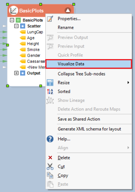
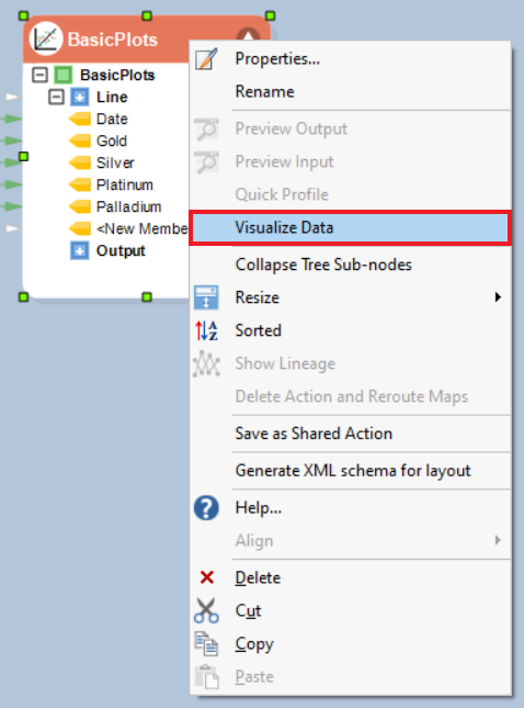
11. To visualize the plot, right-click on the header of the Basic Plots object and select Visualize Data from the context menu.
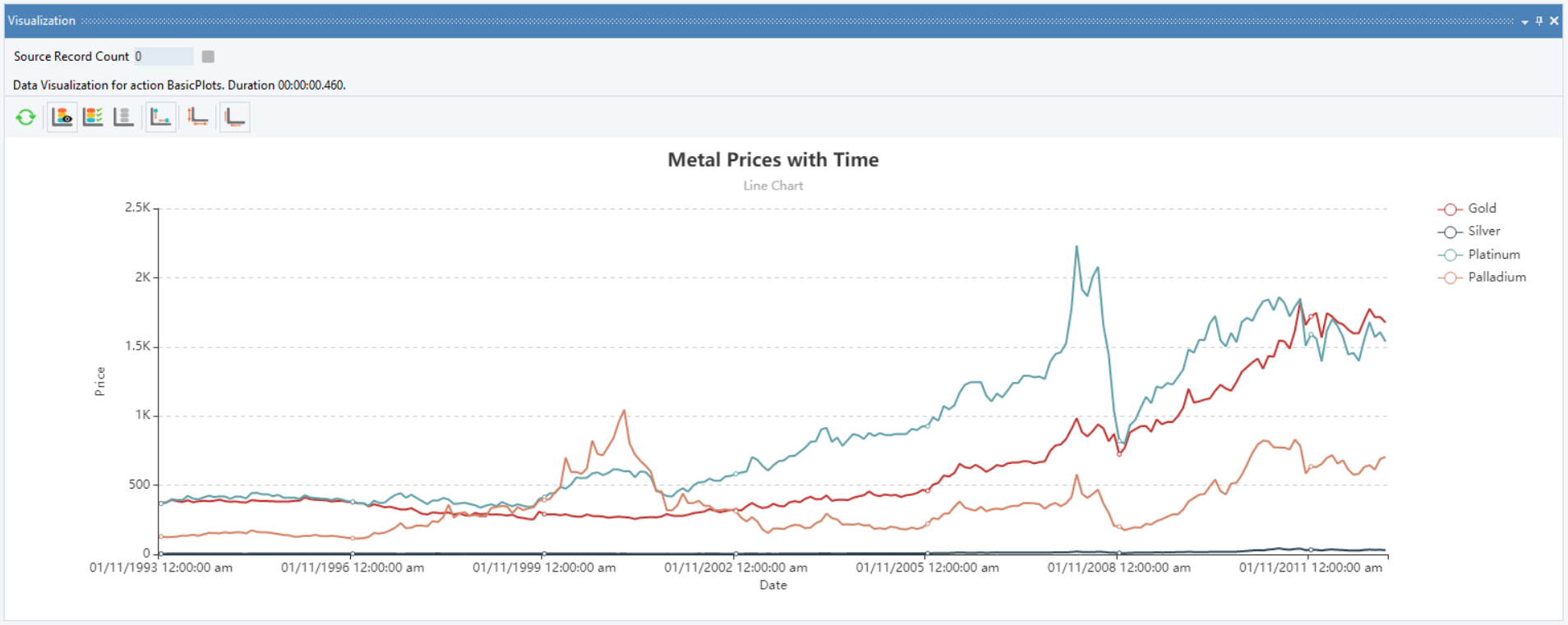
12. A Visualization window will appear. This window can be resized by dragging the boundary while it is clicked. Alternatively, it can be undocked from the bottom pane and viewed on the best scale.
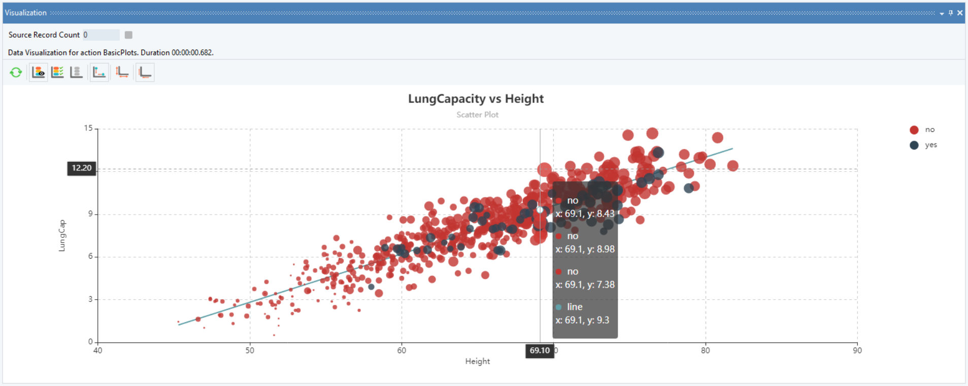
Observe that the graph is interactive, you can hover on the data points to display the coordinates.
Line Chart
Line Chart is a simple but effective graphing method to visualize the data under consideration. Here, we can plot the data of metal prices with time, stored in an Excel Workbook Source.
Using Basic Plots
1. Follow steps 1 - 3 of the Scatter Plot example given above.
2. Set Plot Type to Line.
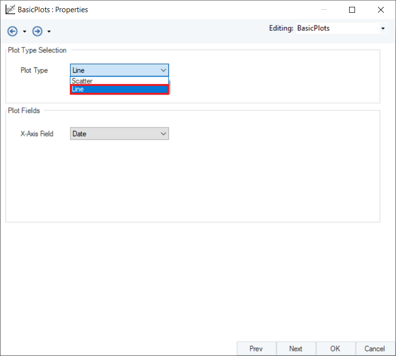
The Properties screen has changed as per the selected plot type, and an option to select the X-Axis Field has been added to the window.
3. Select Date as the X-Axis Field from the drop-down menu.
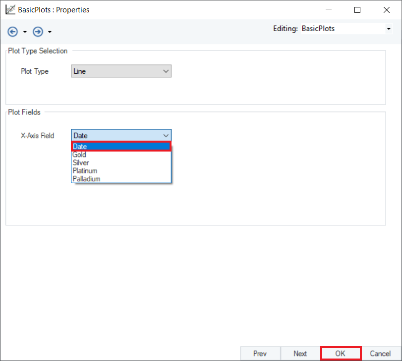
Click OK.
4. To visualize the plot, right-click on the Basic Plots object’s header, and select Visualize Data from the context menu.
5. A Visualization window will appear. This window can be resized by dragging the boundary while it is clicked. Alternatively, it can be undocked from the bottom pane and viewed to the best scale.
This is how you can use the Basic Plots object in Astera Centerprise - Data Analytics Edition.